Work Process
Hello everyone! Following last week's Adobe Livestream (Part 1, Part 2) I was invited to by Codi Bear, I decided to share the final illustration as well as more in-depth information about my work process.
1.RESEARCH
The first step I took was to take note of the elements present in Codi Bear illustration. Here is what she did. A cute little bunny reading a story in his bed with an oil lamp. I see a castle in the book, a beautiful quilted blanket, a kid’s drawing on the wall, a cute and original rug with carrots.
Illustration by Codi Bear.
I wondered how I could take the same theme and elements and create a unique piece in my own artistic style. I asked myself many questions. Like, what kind of bed would I naturally draw? How would I have drawn an animal reading in its bed? What kind of lamp would be on the bedside table? I then did an online image search. I saved the ones that inspired me the most.
Photo credit from left to right: Cox & Cox, Sara Johansson, and.home Studio, Urban Outfitters, Ashley Broviak.
2. SKETCHES
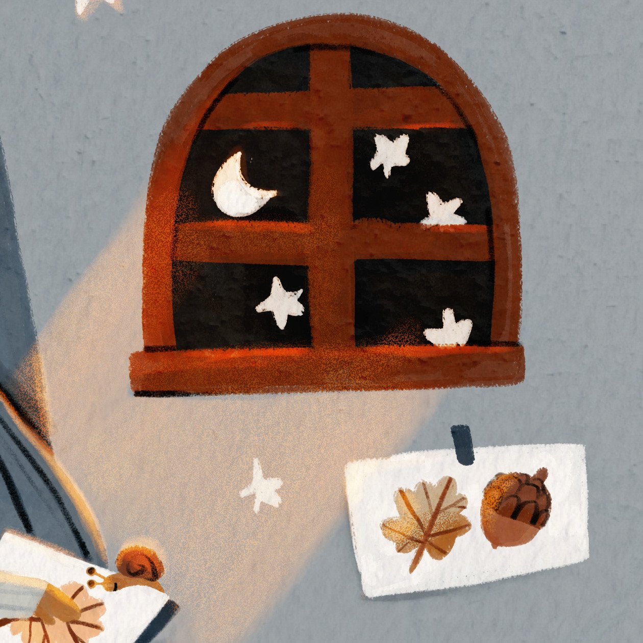
Then I started sketching. I decided to add a canopy over the headboard. I wondered where its home would be, in what kind of environment? Maybe in nature, close to the forest or a field, so maybe there are insects around somewhere. I had the idea of a snail lamp. I wanted to come up with my own idea for the pictures inside the book and the stars inspired me to draw the earth and the moon. I added carrots to the children's drawing and to the rug, just like Codi did.
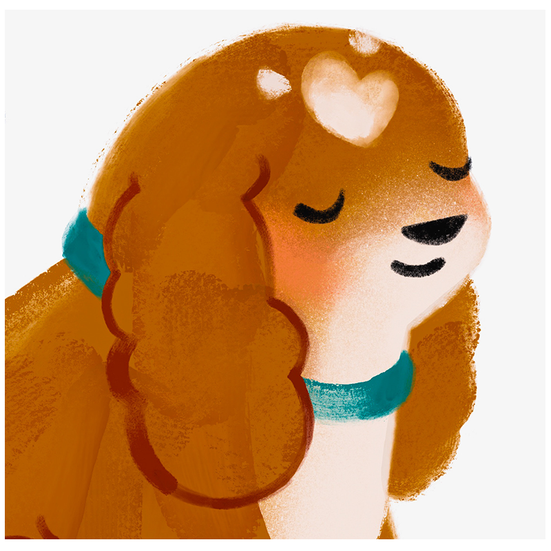
Then I let some time pass and came back to my drawing with a fresh look. I immediately noticed the resemblance of my rabbit to Codi's. I like my illustrations to be unique. I don't want to copy another artist so I decided to choose a different animal. I asked myself what animal I would like to add to my portfolio that I don't already have. So I chose the fox. Oh yes, and the fact that this animal is an orange one helped me because I already had in mind that I wanted to prioritize oranges and blues for this illustration. A green animal would not have been appropriate in this case for me. I then redrew his face more in profile so that its outline would be more easily readable by the viewer. At this point I realized that the carrots were out of place. I chose oak leaves as the theme for the child's drawing, the book and the rug. Here is my final sketch.
3. mood
When choosing my colors for this illustration, I first thought about the atmosphere I wanted to create; a comforting atmosphere, an autumn evening in the warmth of a house. Since the light is blue at night and the lamps have a warm yellow-orange hue, I decided to combine these two colors together. I used the eyedropper tool by choosing colors from previous illustrations, like the squirrels in a tree in the moonlight. I chose a blue and a brown orange and lowered the brightness at different stages to get lighter shades of the same colors. Then I added a pink, a beige, a yellow-green khaki and a purple. I have a broad palette of main colors that I refer to whenever I need them. This set of colors defines my artistic style. Whenever I need to color a sketch I have done, I choose my color from this palette to create new color combinations. This way I can illustrate different moods and subjects while maintaining a consistent look and feel throughout my work.
4. Textures
For the texture of my work, I strictly use digital gouache and colored pencils. This illustration was done in the app Adobe Fresco on the iPad. Here are the four brushes I used for this illustration. There are all from Kyle T. Webster. His brushes are available with no extra costs to Adobe Photoshop and Adobe Fresco subscribers here.
5. Colour Roughs
I don't always do colour tests before I start painting the final illustration but when I do, it looks like this. I add colour pretty quickly and very roughly. The goal is to rapidly see if everything fits well and if the contrasts are good. My goal is always to have the viewer's eye immediately drawn to the important part of the illustration. Here, I want people to see the fox first, its eyes, its face, then the book. I usually start adding colour where I am sure it should be a specific one and not another. Then I add the rest of the colours by planning their relationship to the fixed colours. For example, I make sure that they complement and balance each other so that the viewer's eye can wander freely across the page. The goal is to allow the viewer to relax and feel the mood of the art piece. This is also why I like the elements of my illustrations to be organized in their composition. I chose the second sketch, the one with the blue canopy. I immediately saw that the darker colour directed the eye towards the center, towards the fox. That's why I chose to add blue around the fox's bed and to use orange, brown and pink near him.
6. FINAL PIECE
Now it's time to start colouring the final piece. I lower the opacity of my sketch layer to about 25%. I usually start with the main subject, which is often the character, and then continue by adding color all around until I am finished.
7. Adding Shadows and Light
I don't do this step on every piece I make because I like my illustrations to be as flat as possible, but when I need to create a specific mood, I do. I start by adding the shadows using the Wet Gouache brush with a medium blue colour on a layer above the grouped elements. This layer is set to Multiply. Then I add the light with different brushes on different separate layers. I play with the opacity of each layer and choose what I think is the most harmonious result. The layers for the light shades are usually set to Overlay but sometimes I also use Hard Light. And the light layers are above the shadow layer.
8. Finished illustration
I have also uploaded the time lapse video from Adobe Fresco to Youtube if you are interested to see the process from start to finish!
This is it! I hope you liked it and that you learned something. Let me know if you have any questions and I will be happy to share my knowledge. Thanks for reading up to the end!
